Catalina Florea · Design
What was the actual tension in this brief?
Everyone kept asking for heritage or bold. Nobody asked for both until MLSJ did.
Case Study 04
Partner
Major League Show Jumping
Category
Show jumping · CSI5*
Engagement
2025–Present
Scope
Who built it
Catalina Florea · Design
Everyone kept asking for heritage or bold. Nobody asked for both until MLSJ did.

Ben Dalziel · Product
The collectible had to mean something after the season ended, not just during it.

Luke Wojewoda · Frontend
Standings that update mid-round look easy until a few thousand people are refreshing at once.
Shawn Robinson · Backend
A username doesn't remember your first event. The card does.
Where it stood
Since 2021, MLSJ built a real CSI5* circuit — eight to ten events, $12M in prize money, bigger events chosen over more of them. What hadn't caught up was everything fans and sponsors actually see: a site and app built strictly for people who already knew the sport, in the same saturated blue worn by every other major series. Correct on paper. Invisible next to competitors wearing the same color.
The part everyone skips
Lean into the sport's existing codes and the brand disappears into a category of old money and longer histories. Lean all the way modern and it risks losing the luxury credibility sponsors expect — tacky instead of premium. MLSJ was direct about which it wanted: a fearless innovator, edgy, elegantly bold — not conventional, bland, a dull traditionalist. That's not a color brief. That's asking one brand to be elite and inclusive, for an audience running from a rider's grandmother to her seven-year-old grandkid at the rail.
The idea we brought
Every other series in the sport picked a lane — heritage or spectacle, blue or nothing. MLSJ, pulling $12M in prize money and premier-caliber riders, didn't need to: it needed an identity elegant enough for the sponsors it has, bold enough for the fans it doesn't have yet — and confident enough to finally monetize, connect, and grow because of it, not despite it.
What we built
01 · Brand + site/app
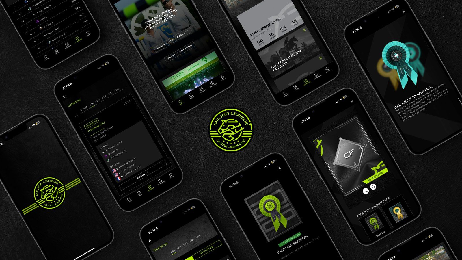
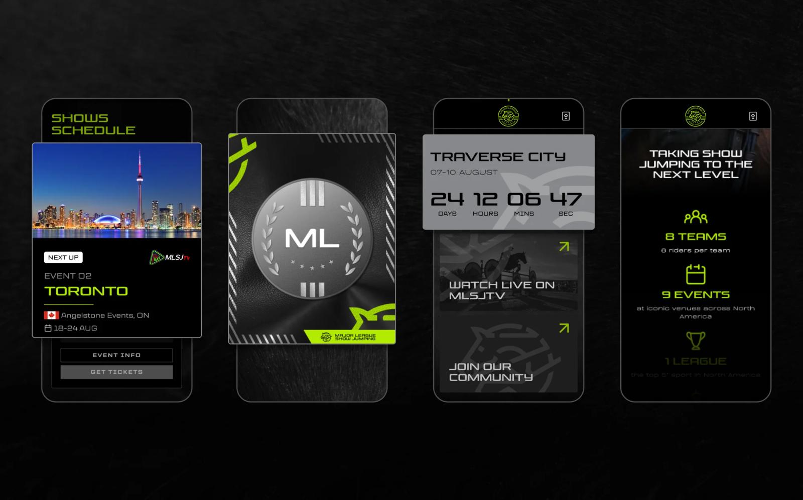
Off the industry's default blue, without losing the luxury cues sponsors expect — paired with a live data feed fast enough for a rail-side crowd that spans a seven-year-old and their grandmother.
02 · Collectible rosette cards
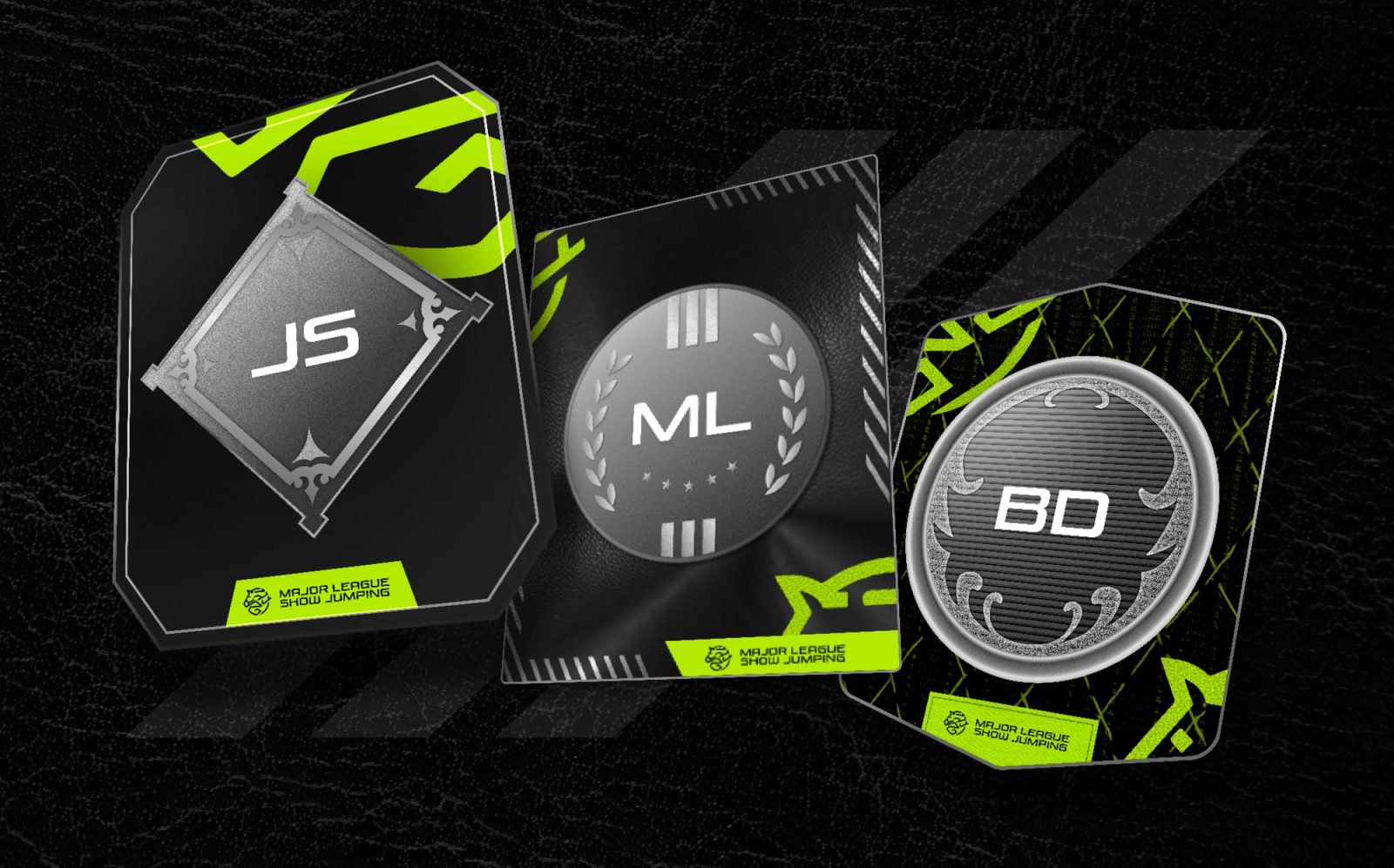
Rosettes already mean pride, place, and memory in this sport. Each competition gets its own collectible card designed as a custom rosette — unique to its location in color, pattern, and detail.
03 · Profile card
A rider, staff, or fan's initials at the center, framed by jump poles or laurels — a badge-like mark of identity pulled from classic equestrian crests and monograms.
04 · Data pipeline
Organized dispersed data sources into a usable structure. We built the pipeline that parses it, adds the derived stats MLSJ didn't have yet, and writes all of it into the database that runs standings and results. As part of this work, we learned how a show jumping event is actually scored.
05 · Real-time stats
Live standings, derived stats, and the order riders enter the ring, pulled from the new data platform and updated live as a round happens. Working out who's up next and making the fan experience feel interactive took as much work as past results, the difference between updating and feeling alive from outside the rail.
The mechanic
01 · Sign up
A personalized mark of identity from the first visit, not a username.
02 · Collect
Custom to its location every time, so three events followed means three genuinely different rosettes, not the same one three times.
03 · Compound
Competed, supported, or followed from afar — the collection becomes a personal record of the journey, the same way a rosette means more the longer it's hung on the wall.
The result
Mobile · share of visits
36.8%
Fans carrying the league with them, not just clicking a link
Fans · registered
21.47K
Made an account, since launch.
Visits · lifetime
107.9K
Across web and app, since launch
Culture, not audience
MLSJ didn't need to convince anyone the sport was worth watching. It needed a brand that made new fans feel like they'd arrived somewhere established, not somewhere still finding its footing. Same throughline as Williams: fandom isn't a feature you bolt on.
Contact
Next